
The impact a design can have on a person's life always inspires me
Hi, I’m Gian, a Product Designer based in the Bay Area, California with an Aircraft and Automotive Mechanic background. My ultimate goal as a designer is to collaborate with an innovative team to create products capable of making a difference in the lives of others.
About the Project
As a UX/UI design student, I was tasked to design a conceptual application for a fictional company named “Matchbox.” The project’s goal is for students to showcase and apply what they’ve learned throughout the design process.
What is Matchbox?
Matchbox is an online marketplace directly focused on collectors so they can securely buy, sell, and trade high-value items easily online.
My Assigned Feature
To focus on elevating the user’s “browsing the marketplace” experience.
User Stories
-
As a buyer, I want to be able to browse the marketplace for items I might like.
-
As a buyer, I want to be able to search the marketplace for something specific.
-
As a seller, I want buyers to find my listed items for sale easily.
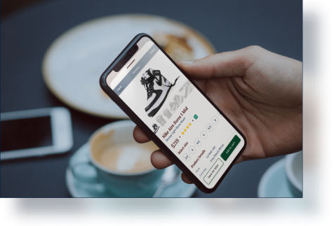

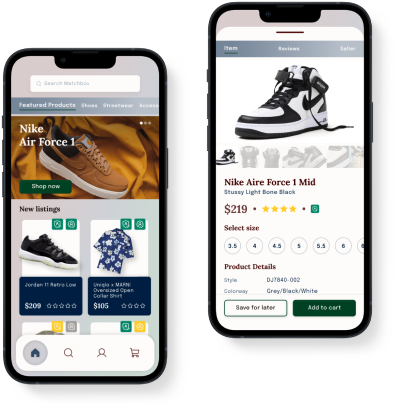
Matchbox

Collect and connect - the collectors online marketplace!
UX Researcher • UI Designer
Figma • Google Forms • Notion • Concepts
Discovery
-
User Interviews
-
User Surveys
Definition
-
Affinity Mapping
-
Customer Journey
-
Mapping
-
Problem Statement
Develop
-
Ideation
-
Minimum Viable Product
-
User Flow
-
Sketching & Wieframing
Deliver
-
Prototyping
-
Usability Testing


The Process
User Interviews
Conducting user interviews with six participants gave me qualitative insights.
Main Objectives
-
To find out what the user’s processes are, like how to obtain an item for their collection.
-
To learn what they like or dislike most about the process
-
To gather any feedbacks, positive or negative, in order to improve the user experience
Key Findings
-
Item Acquisition
-
Brand new items are obtained through either local or online retail shops
-
Used items are obtained through local meetups, online marketplaces, social media communities, and forums.
-
-
User Frustrations
-
Shopping bots - mostly outbuys real human buyers.
-
Item authenticity - very few online marketplaces with a trustworthy authentication process exist.
-
Lost/Stolen/Swapped items in transit for delivery.
-
-
User Desired Feature
-
Ultimately, an enhanced browsing filter system.
-

User Surveys
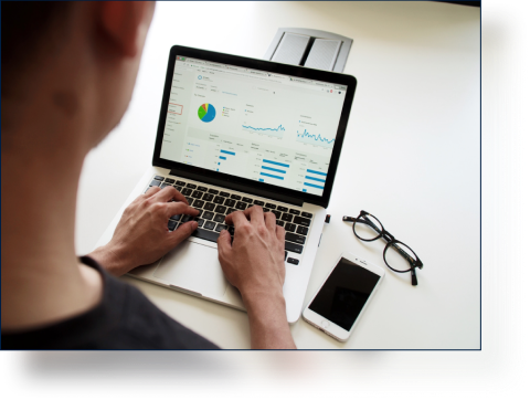
To know more about the user’s experience browsing an online marketplace, I surveyed 13 participants. The questions focused on learning about the apps they use: to browse for products, how to easily find an item, and to find the most important features while browsing.
Results
-
62.5% of participants shopped through their mobile devices.
-
The majority were satisfied with how easy it was to look for an item and to browse the marketplace.
-
Filtering and“keyword search were the most important features followed by sorting and saving items.
Learnings
-
Mobile app user experience is key for my Minimum Viable Product.
-
Keep the interface familiar, but better than other online marketplaces
-
Improve how the filter and keyword searches work while implementing a more robust sorting and save item feature.


Discovery

Definition
Affinity Mapping
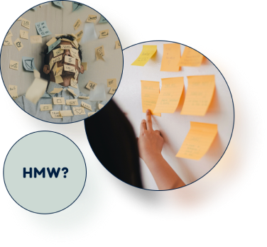
Aftering gathering all the information during the discovery phase with other students, we created an affinity map. We were able to sort and organize the data collected into groups with common themes and develop how-might-we statements. We were able to narrow down the problem and focus more on the user’s needs.
Focus how-might-we statements
-
How might we easily authenticate items for both the seller and buyer?
-
How might we build a trustworthy authentication system?
-
How might we have a more effective and powerful search function in the app?
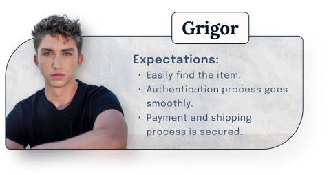
Customer Journey Map
Using a customer journey map helped me better understand the user's thoughts and emotions throughout the process of using a similar app. Here we have Grigor, a freshman in college and who just landed his first job. He’s also a shoe and streetwear collector. Grigor’s excited to buy a pair of shoes he's long been waiting for, especially after seeing that it’s finally available in his size.

The Challenge!
With all the data collected, a lot of the user's frustration points to the product’s authentication process. Due to my assigned feature, browsing the marketplace and not the authentication process, I had to think differently to come up with an effective problem statement. Assuming there's another team handling the authentication process, I used that idea to define the problem and added a few relevant user stories.
“As a buyer, I want to be able to browse the marketplace for items I might like"
“As a buyer, I want to be able to search the marketplace for something specific"
“As a buyer, I want to be able to easily find authenticated items”
“As a buyer, I want to know if the item I’m looking at is authentic or not”
"As a seller, I want buyers to find my listed items for sale easily"
“As a seller, I want people to know that what I’m selling are authentic”
Problem Statement
“As a collector that is actively buying, selling and trading high value items online, I struggle with browsing the marketplaces for authentic items because the marketplaces does not show any proof of authenticity nor let you filter authenticated items.”
Ideation & Minimum Viable Product (MVP)
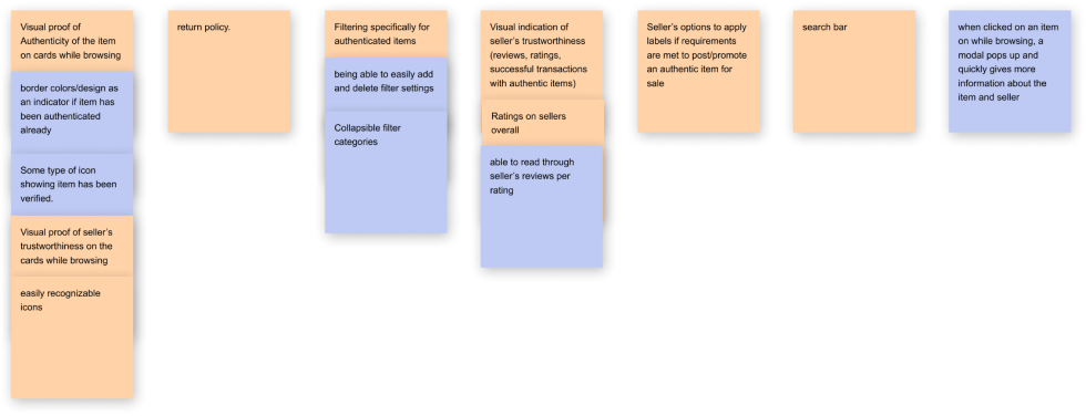
Now that we’ve defined the problem, it’s time to gather ideas for solutions. I facilitated an Ideation Jam and Feature Prioritization Sessions with other students to generate as many ideas as possible. Similar to the Affinity Mapping, we organized and sorted those ideas into groups with similar themes until we could establish the features needed for the MVP.
User Flow, Sketching & Wireframing
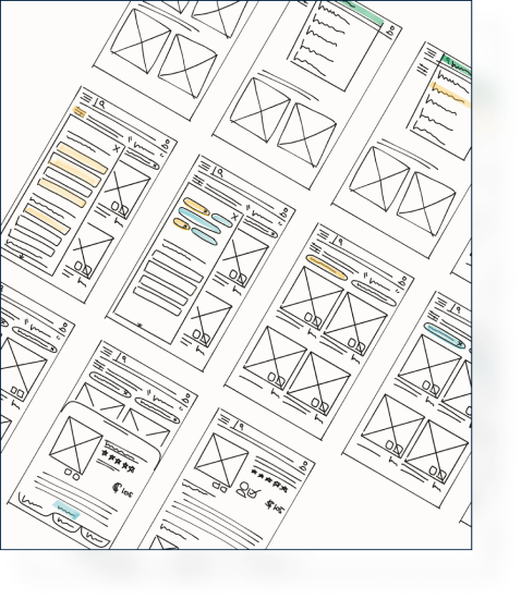
With MVP’s features established, I wrote down some user flows and sketched out some quick drafts for the design. Then, wireframed it to get the MVP ready for prototyping and usability testing.


Development
Prototype & Usability Testing
It’s time to test the usability of my design to the public. I gathered six different users for my initial test and another six for the revised version. All data gathered were recorded in Notion. Scores were determined by the success and difficulty of the task.
Issues
Two out of four tasks scored low for the following reasons:
-
The Eye icon on the card for “quick view” was unfamiliar and misleading.
-
The Filter icon is unfamiliar and users were looking for a button to save the filters.
-
Similar keyword search pills were not clearly identified and therefore were ignored by the users.
Changes
-
Changed the Filter icon.
-
Redesigned the product card.
-
Added a heading for the pills for easier identification.
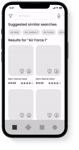

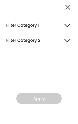
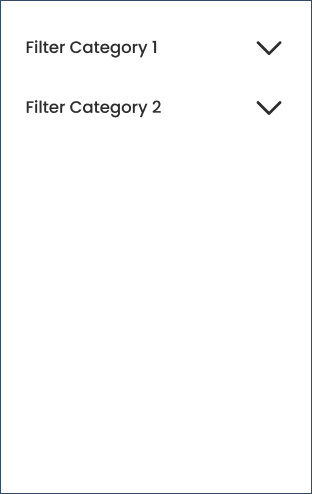

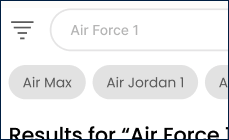
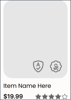

Hover over an image to see the changes
Final Prototype
With everything put together, here's the final design and prototype of my project for Matchbox:
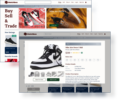
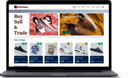
Desktop Version


Deliver
What I’ve Learned
Even though this is a project for a fictional company, I took it very seriously as if it was a real design that will go through development. I took my time to learn each step deeper and make sure I understand the process. Here are the major things I have learned during the experience.
User Interaction
During my user interviews and usability testing, I was able to experience and practice user interaction with family and friends. For an introvert with a fear of public speaking, this was extremely challenging for me even if I was working with familiar people. Still, to become successful in this career, I knew I needed to overcome these fears by becoming more confident in myself and what I do.
Think Outside The Box
As mentioned before, most of my research indicated the authentication process to be the point of frustration. While my assigned feature was browsing the marketplace, I felt like those data were not as helpful to my project. It drove me to think outside the box to move forward. The biggest factor learned was being able to shift lenses in order to see the problem from many angles to see other possible outcomes.

Conclusion
More projects coming soon... Stay tuned!

Coming soon!
Working on a feature concept for Apple Maps.

Coming soon!
Currently working on a redesign of a company's dashboard to be used as an update for their web application